Showing posts with label Cover Art. Show all posts

Wednesday, December 7, 2022

The Beauty of Book Covers by Eileen O'Finlan


                        Click here for purchase information     Click here to visit Eileen O'Finlan's webiste

As I write this blog post, it is less than a week since our celebration of Thanksgiving here in the U.S. That holiday always brings with it a time for reflection on the people and things for which we are thankful.

As I thought about my own debts of gratitude, I could not help but include the extraordinary art director who creates the amazing covers for BWL's books, Michelle Lee. Not only do I love the covers Michelle has created for me, I have yet to see a single BWL book that doesn't have an outstanding cover. Click here to check them out for yourself.

Whether it's rational or not, book covers are widely considered to be the most important factor, or at least the first one, in whether or not a reader decides to consider a book. That makes covers extremely important.

One of the most exciting moments for an author with a new book about to be released is his or her first look at the cover. So when I knew the cover for my next release, All the Furs and Feathers Book 1 in the Cat Tales series was on the way I could hardly contain myself as I waited to see what Michelle would create. Just as I expected, I was not disappointed. The cover is fantastic!

I am not quite ready to do a complete cover reveal yet. That will come when the pre-order is available and I have it to link the cover to. But meanwhile, here is a sneak peek at what everyone will see when All the Furs and Feathers is released on February 1, 2023.


Friday, April 9, 2021

Covering Up!

So as the title and the picture suggests, I have received my new cover image for my upcoming novel Ballroom Riot! Isn't it pretty? Don't you just want to hold it in your hands and admire all art deco involved? 
Assuredly not... But one can dream

Don't you? DON'T YOU?!

Ahem...

Our cover designer Michelle does an amazing job in working with the authors of Books We Love Publishing to ensure our literary vision is presented with the best cover art imaginable... and believe me, we're writers! We imagine up some pretty strange stuff sometimes...

Believe me folks, get a cover designer.
Not even Stephen King could sell
a book with a cover page as terrible
as this....

  
In fact, this isn't even the first image she's done for me. She also did the design work on The Curious Case of Simon Todd, another book I wrote and published with Books We Love back in 2018.


In the grand scheme of things, book covers are pretty important. We've all heard the old adage of don't judge a book by its cover, but sticks and stones break bones and names hurt too, dammit! So not every maxim is true 100% of the time. 

This is why every good book needs an amazing image to covey the general theme of the plot or main characters within. I mean, unless you're a big wig author like George R. R. Martin or Dean Koontz... then you're name's probably enough... Right?

When's Winds of Winter coming out
George? Huh?! WHEN, GEORGE!?

But assuming you aren't famous yet, and if you are, Hey! How about an endorsement? Then your name broadcasted in the middle of the page isn't likely going to cut it. Unless you're name's Isa Goodread or something. 

This means research is needed. What makes a good cover? In my humble opinion less is usually more. I tend to focus on a few key elements that encompass the story. Take Ballroom Riot for example. There is a girl, a dragon and some stylistic elements that hearkens back to... say the 1920's? 

A reader should know by a glance the general themes they will encounter in the story. If it's too busy, or there are too many images, the point can become lost. Remember, you're competing for attention out there. You don't want your amazing story overshadowed by sexy Fabio with his shirt off, do you? 

Honestly... this image is 
still too busy for my taste.
Well maybe you do, but unless you can go back in time and contract young Fabio to pose for your amazingly written romance, readers will be drawn to the main elements you authors seek to showcase. 

Give them an interesting focal point. If they are into naked men, and your story is about naked men, give them a half naked man! But don't surround him with a myriad of other stuff we don't care about! 

...or at least, don't care about as much as we care about naked men... 

Don't get me wrong. We don't want to entice the wrong audience. We don't want to mislead the reader. We want to pull them in at a glance and make them pick up the book
Gimme that cold, hard cash, baby!

Then they can read the blurb at the back, see if it's their cup of tea, and hand over that sweet, sweet money... 

Sure! There's a market for busy images. But unless your Waldo, or know somebody like him, I'd strongly recommend sitting down, having a think, and figuring out a few choice themes your book is about and how best to showcase them on the front cover.  

Don't forget about colors and fonts! Or your sexy little author name somewhere where we can all see it and be proud of you! Talk it over with a cover designer too. Again: having someone like Michelle is a Godsend. You definitely won't regret it.   

I'm proud of you and find your story a-peeling!


Saturday, July 9, 2016

Overcoming Obstacles by Michelle Lee

Hello cover art aficionados. My name is Michelle, for those of you who haven't read any of my past posts.  I am a part of the BWL community, but not as an author - I am the one who gives the books their outer wrapping. 
In the past, I have done a series of posts about all things covers.  Please feel free to check them out.  They are linked at the end of this post. 

Now for the purpose of today's odd topic - Overcoming Obstacles.

I want you to take a moment, close your eyes and imagine a beach.  The waves of the crystal blue ocean flicking against the tiny white grain of sand along the water's edge, turning them a damp beige.  The feel of the wind rushing through your hair, the heat of the sun against your bare arms.  Picture dolphins jumping from the water, playful and free, just off in the distance.

Now come back to me.  Remember that scene ... I will get back to it in a moment.

What some of the BWL family knows is that in addition to being their resident pain in the rear cover art goddess, I am also a biology geek and a teacher.  What most do not know (but will now) is that I am dyslexic.  I can't read long streams of numbers without getting a headache.  Math is a nightmare for me - especially algebra.  And until I was in the fourth grade - reading was also  major nightmare.  I avoided it like most sane people avoid snakes and spiders.  But something happened the summer after third grade ... I discovered that I didn't need to understand all of the words.  That my mind would fill in and adapt, if I gave it a chance.

Take a look at the following image:

What you are seeing is what reading is like for me - and yes, this passage above makes perfect sense to me.  When reading aloud in earlier classes, when we came upon an unfamiliar word, we had to sound it out.  But my sounds never quite matched what the words were, so I great discouraged.  I was called stupid by other kids, and as a shy person naturally, it made me withdraw more.  But that summer, my sister spent a lot of time with me, reading to me, and as I heard her voice, I would link the words to the sounds in my head, and pull it together.  Something I wasn't able to do in class with other kids snickering and teasing me.

That summer, I discovered reading.  And the more I read, the more I loved it, and the better I got at it.  Now, as an adult, I read bout 3-10 books a week, sometimes hitting 45-50 in a month (various lengths of course - some are novellas, some novels).  I still struggle when reading aloud - so I avoid it when possible.  But when I read silently to myself, but brain is able to infer, fill in, and adapt to what I am seeing.  Sure, I might miss an occasional word, struggle with the difference between form and from, but it doesn't decrease the please of reading.


I am very up front with my students about my troubles reading (and writing) so that when I do write something wrong on the board - they know they can correct me, that I WANT them to correct me.  And yes - it does happen often.  Some are amazed that I am "allowed" to teach, others that I made it through school (including college) with this cloud hanging over my head.  But some, the ones that need it the most, understand that the things that might get us made fun of, the things we struggle with, are not insurmountable obstacles.

For me, dyslexia was simply an obstacle that I needed to know how to overcome ... and then I did so.  In addition to being a teacher, I am also a published author ... something else that my obstacle could have held me back from, had I let it.

So what does this have to do with the scene I asked you to imagine earlier?  In addition to dsylexia, I also have what it called by many 'mind-blindness', the technical terms that has been proposed is Aphantasia. 

Phantasia is the ancient greek word for, among other things, imagination and images.  A is a prefix meaning lacking, without, or not.  So aphantasia means without images, or mind blind.

Think about that for a minute and remember the ocean scene.  When you closed your eyes, did you 'see' the ocean?


I don't.  I can hear a narrator telling me what it looks like, and I have found that if I keep up a running narration in my head during some moments, that I can recall them as an auditory memory later.  

I can look at images and recognize things ... like an actor, or a certain type of owl.  But closing my eyes and telling my principal what a certain student looked like, if I didn't already know the student?  Describing a bird I just saw flying by, and trying to identify it from memory?  Practically impossible. I can't visualize the person or owl to give the details.

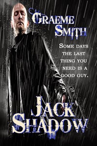
Now remember that I said in the beginning of this post - I am BWL's Art Director and primary cover artist.  Which means I take stock photo images and somehow morph them, blend them together, to create covers.  Covers like these:


Each of these covers is at least 2 images, some contain up to 5.  Somehow I had to 'visualize' how the images would come together - right?

Nope.  It's not that simple. I can't just close my eyes and use my imagination.  When I am working on covers, I have numerous windows open on my computer and I have to place images side by side, so that I can see how they would fit together.  I can't just close my eyes and let them merge, trying out different combinations.  

For example, I could tell you by looking at these two images side by side, that the dolphins could be placed into the beach image, and with the right text, make a great cover.  Maybe with a woman in the foreground standing, looking out over the water.

For many of you, you could probably close your eyes and actually see it come together.  I don't.


So much of my process, I don't even understand.  I know some images I will see and have a flash of insight - that it would make a great cover with the right other elements, but I don't actually visualize the finished product.  

I never see it until I actually create it.  

So what are my dreams like, you might ask?  Well ... that is a topic for another post. :)  (Have to keep you coming back somehow - right?)

As for why I posted this ... I admit, the obstacles I face are NOTHING in comparison to what many others face (and I do not in any way want to trivialize those obstacles) ... but at the same time, while mine are seemingly small in the grand scheme of things, they can seem insurmountable to dreams of becoming a writer or artist.  Just like I want my students to know, I want those reading this blog to know that they can be overcome.  More than that though ...

When it is physical, we can point to it and say 'ah ha! there is the issue!'.  But when it is something in the brain?  I always knew I was a little different, and thought something was truly defective in my brain for the longest time.  I couldn't read word correctly, I couldn't visualize images when I closed my eyes. I had to be broken somehow right?  But guess what ... aphantasia and dyslexia are a lot more common that I ever imaged when I was growing up, thinking myself damaged somehow.  

If you are interested in learning about Aphantasia, check out some of the following articles:

* * *


And for those who wanted to find my older posts ... here they are.

* A whole series about various aspects of covers:
     - Image Selection
     - Cover Elements
     - Series
     - Cover Branding
     - Heat Levels

* Dear Artist - a Dear Abby kind of thing, but for cover art questions (feel free to leave questions in the comments for future posts)

AUTHOR RESOURCES -- well worth checking out!!!!

Black and white and shifters all over -- probably one of my favorite posts :) Research is so very important!

I also have a couple odds and ends posts


Tuesday, September 15, 2015

Cover clones, movie posters, and a cover artist's opinion by Michelle Lee

WARNING:  The post ahead contains my opinions.  Read at your own risk. : )  
And hateful emails will not be read - so don't waste your time sending them.


As a cover artist, one of the things I have to try and balance is the overall look of the covers I create, the designs of the author, the needs of the publisher, and the limitations of stock art.

Let's face it - despite what a lot of people thinks - most publishers are switching from doing photo shoots for each cover to using stock art.  This includes a lot of the big boys in NY.  I have only seen a few authors, generally the big names, still getting individualized photo shoots.  The rest are using stock art.

Now this can be a good thing - since it makes costs a lot more manageable.  Instead of $200+ for an image for a cover, you are looking at $20ish for two to four images.

But it can also be a bad thing, since each image is available to anyone who wants to use it, which can results in some images being used on multiple covers.

Yes - this can be frustrating for authors, and for readers, but realistically, it is simply the way it is.  As a cover artist, I do my very best to make each cover unique in and of itself, including using more than one image per cover.  (There have been a few times, generally where I was requested to use just the one image, and add text, or where adding more images made the cover cluttered - but those are few and far between.)

There are dozens, if not hundreds, of articles out there now shaming cover artists for using images found on too many other covers, as well as warning authors of the dangers of stock art, etc.  It is the shaming of cover artists that I am going to address today.  I get having a pet peeve ... but many of the things cover artists are blamed for are often outside of our control.

I saw one post where it plainly said that if a cover artist uses an image that is already used on an existing cover - they should be ashamed of themselves.  To this I would say, how many books are published each and every month - in let's say - the romance genre alone?  How in the world am I supposed to go through each of the covers and make sure that an images hasn't already been used.  Yes, it is easy (sometimes) to find repeating images - but in most cases, it's not. So how am I supposed to find each and every image that has been used to make sure I don't use one of them?

I saw several posts that said basically that if a cover artist uses a repeated image they are robbing/lying to the author.  Most authors I know are aware that their covers are created using stock art.  In the BWL forms, in fact, we expressly state that we will be using stock art, and ask the author to select images that appeal to them.  For the commissioned covers I create via Stardust Creations (shameless self-promo plug there - visit me for your cover art needs LOL), I also warn authors I will be using stock images, and encourage them to find images they like and I will purchase rights to use them and craft a cover from them.

This website tagged one of my BWL covers in their image ... and it wasn't the poster that basically slammed cover artists, it was a few of those that commented.


Here's another image example - this time without one of my covers.


Suffice to say, stock images are not exclusive images.  Exclusive rights to images are expensive, and most publishing houses, even the big boys in NY, do not go that route much any more.  So yes, as a reader, there will be a little bit of frustrating every now and then as you look at a cover, see a familiar image, and have to double check to make sure you don't already own the book.  I have had to do this myself from time to time.  BUT, the trade off for this is that small presses are able to open, and survive, and authors who the big boys in NY rejected are able to make a go of it, which means more options for me - as a reader.  I like getting to pick what I want to read, rather than just what the big boys say is sale-able.  The whole paranormal romance genre, at one time, wasn't something the big boys would touch - yet look at how popular it is?

How many of your favorite authors have mentioned on their websites they were rejected by the big boys, so they went small press or even (gasp) the indie route?  90-95% of the books I read, and I read about 35-50 a month, are small press or indie.  They are available because small presses can operate because of stock images sites, and other lower cost options for product production, then were previously available to them.

All that said, I am curious that cover artists have been slammed - a lot lately - but Hollywood hasn't.  We may reuse a stock image seen on another, but Hollywood creates poster clones all the time and no one says anything.  By this, I mean with all the individual options available to them, the ability to shoot whatever pose they want with the actors and actresses, all of the movie stills to use, they still often create posters that look like other posters.

Case in point ...


For this one, not only did they use the same colors and basic image layout they used the same FONT style and color.

Want more?  Check out this YouTube video devoted to them.  I like the comparison at 57 seconds - the cult classic Army of Darkness and whatever that other one is.  (No nasty emails please!)

So why are we held to an insanely high standard that no one can really meet?  I mean, come on.  I know the frustration of seeming the same images used, I get frustrated sometimes because I can't find images to use but ones that I know have been used, but this 'clone' phenomenon isn't new and it isn't limited to cover artists.

So come on, give us a break already.  Most of us don't try to mirror each other, it just happens.  And limited stock art options aren't really our faults.  We do the best we can, with what is available.

~ Michelle

Thursday, January 15, 2015

These are a few of my favorite covers ...


As promised, here are five of my favorite BWL covers that I have created.  Now keep in mind, I said five of my favorites - not my top five favorites.  As a cover artist, I often pour a little of myself into each cover.

It's just so pretty!

LOL

Seriously though, one of my favorite covers to date would have to be Ring Around the Rosy by Roseanne Dowell.  I love the way the red and the gold compliment each other.  The background has a nice kind of mysterious focus to it.

The bleeding rose just enhances it.

Amazon

* * *

Up next is Into A Dangerous Mind by Tina Gerow.

Amazon

With this one, I quite simply love the couple.  They are sexy, mysterious, and I love the holding hands.

Again, we have a nice contrast of red with another color, in this case black and the peach skin tone.

Here's the full print wrap - just for fun.


* * *

 Changing focus, let's look at a futuristic - Vijaya Schartz's Alien Lockdown.

With this one, the black is nicely contrasted with the grey/blue of the text and the stars in the background.  The futuristic corridor is faded into a star field to give it that kick.

I also love the woman - she is sexy and sassy and has attitude.

Plus - leather.  Yeah.

Amazon


* * *

 Another nice cover with a black focus is A Novel Murder by Ginger Simpson.  In this case, the background is black and white, then the foreground of white and peach.

I love the image of the woman with the guy, the couple is so sexy, and I love the almost innocence of the woman on the computer.

Amazon

* * *
 And for my fifth pick ...

Victoria Chatham's His Dark Enchantress.

It's bright, sexy and the woman makes this cover for me.

Amazon 

Here's the print edition.

Favorite Cover: Yellow Moon by Ginger Simpson

Juliet Waldron asked for this to be posted for her.


My favorite cover by Michelle Lee is that of "Yellow Moon" by Ginger Simpson. Here is the scene and the setting and beautiful Indian maiden whose story we'll definitely want to read. It's period correct and yet mysterious and beautiful, too.

I'm jealous of this cover.

It was a tough pick, tough, and "The Barbers" by Katherine Pym and Kathy Fischer-Brown's "The Partisan's Wife" would be my runners-up!


Favorite Covers by Michelle Lee

Jamie Hill's two cents:

BWL's Art Director has asked us to share our favorite cover and why. I had a horrible time narrowing it down to two. In fact, I could easily choose one favorite for each BWL author! But since we're supposed to choose one, I took the liberty of choosing two.

http://amzn.com/B0057AGQ4W
Heart Throb by Janet Lane Walters
Cover by Michelle Lee


Without reading the blurb, this cover gives you a good idea what this story is about. Romance, with a medical twist. I love the graphics Michelle has weaved through the text including the the heart between the words Heart and Throb. To me, this is a beautiful, sexy romance cover.


http://www.amazon.com/dp/B00904HKQE/
Jack Shadow by Graeme Smith
Cover by Michelle Lee


This is a quirky mystery story and again, without reading a blurb you can tell that from this cover. I love the man, the rain, the font choices and of course the tagline. Now go read the blurb. It'll definitely make you want to read the book!


I could go on and on about my favorite BWL covers but there are simply too many to choose from. My own included! But don't take my word for it...check it out!

Jamie Hill


Favorite Covers Challenge

To start off the new year, I decided to do something a little different with my post - I issued a challenge to the BWL authors.  The rules are really very simple - and I am looking forward to seeing the results.

1. Authors are to post a BWL cover that is one of their favorites that is NOT THEIR OWN.  Obviously, they have their favorites among their own covers - but I am curious what they like about some of the other covers.

2. All of the posts today should be labeled as follows - Favorite Cover: book title by author

3. I instructed them to tell us what they like about the cover.  Be creative and descriptive.  "I like it because it is pretty" isn't enough. :)

4. And finally because I don't want repeats - if someone posts their favorite cover before they get a chance to - they are supposed to just respond in the comments section what they like about it.

Now, because turn about it fair play - at the end of the day, I will post five of my favorites and why.

Let the games begin ...


Popular Posts

Books We Love Insider Blog

Blog Archive